Illustrator paper cut tutorial

121615If you are looking for a way to create a paper-cut look with digital tools, check out this Paper Cut tutorial. Using a combination of hand sketching and Adobe Illustrator, Adobe senior designer Lidia Lukianova walks you through just a few simple steps to get this stunning effect. Her example shows a beautiful letterform but I’m sure you could use this technique with illustrations or icons just as effectively.

I am the Invisible Woman

Commute-30 This week I was asked to do a 5 minute presentation at the Photoshop for Designers Conference about a project or tutorial. I chose to present a personal project. It was set up as a casual Ignite event. This was a bit intimidating because you have 5 minutes to present 20 slides and the slides automatically advance every 15 seconds.

I flubbed in a few places and I relied on notes so I wouldn’t get my story wrong. But the next day I had many people tell me that they were very touched by the project. One woman was quite emotional about it and that got me thinking. Maybe I’m not the only creative director or corporate designer or woman who is feeling invisible. So I created a slideshow with the same script and images from my Ignite presentation. I thought I would share it with you just in case my project resonates with you too.

Cheater Chalkboard Calligraphy

062215.01

A friend recently asked me to create a couple of chalkboard signs for her son’s beach wedding and I admit I felt a bit daunted by the project. I haven’t practiced calligraphy in many years and I had never done calligraphy with chalk. I started thinking about how to keep the words spaced properly and decided I needed to figure out a way to transfer the design to the chalkboard before I drew with the chalk. It was easy! You do not have to be a graphic designer or calligrapher to do this. Here are the steps:

What you’ll need:

  • Adobe Illustrator (this technique will work with Photoshop or InDesign too)
  • a laser or inkjet printer
  • tape, pencil, scissors, ruler, liquid chalk markers
  • chalkboard

Create the calligraphy pattern
These instructions show you how to create the design using Illustrator but you can do basically the same thing if you want to create the design using Photoshop or InDesign.

  1. Measure the chalkboard and note its dimensions.
  2. Launch Illustrator and create a document using the dimensions of the chalkboard.
    062215.2
  3. Use the type tool and various typefaces to create your design. Save the file. Here are a few great tutorials about using the type tool in Illustrator:
    Work with fonts from Typekit
    Point vs. Area Type
  4. I created my design in color to give me an idea of where I wanted to use different colored chalk. I also created a black rectangle behind the typography so that I could visualize what the final chalkboard would look like.
    Chalkboard-design
  5. Choose File > Save As to save a duplicate of the design. Select the type and choose Type > Create Outlines.
    062215.3
  6. Select View > Show Print Tiling. This will give you a preview of what the pages will look like when they print. Select the Print Tiling Tool. You will use it to indicate which part of the design you want to print.
    062215.4
  7. Use the Print Tiling Tool to print each area of your calligraphy design. Print the page or page tiles at 100% size. For my design, I printed 4 separate pages to include the whole design at full size. You definitely want some overlap. That will help you align the prints when you combine them.Notice in the illustration below that the inner dotted lines show what you’ll see in the print. The outer dotted lines indicate the edge of the paper. For further learning, here is more printing & tiling information: Printing onto multiple pages using tiling.
    062215.5

Combine the pages to create the full sized pattern.

  1. Take your scissors, some clear tape, and your printed pages and find a window or glass door you can work on. This works best during the day with lots of indirect light. (A glass of wine is optional but I recommend it.)
    062215.6
  2. Holding the pages up to the lighted window, line up the letterforms and once they overlap seamlessly, use the tape to secure the pages together. Continue aligning and taping until all the pages are taped together. You now have a pattern that is ready to trace.
    062215.7
    062215.8

Transfer the design to the chalkboard

  1. Flip the pattern so the back side is visible. Tape the pattern to a window or glass door to reveal the design. If the overlapping pages block you from seeing the letterforms, you may need to trim them a bit. That’s what I did below:
    062215.9
  2. Use a fine tip chalk marker or chalk pencil to trace the outlines of the letterforms onto the back of your pattern. Don’t fill in the designs, just outline them. The chalk that’s left on the back of the paper will transfer to the chalkboard in the next step.
    062215.17   062215.10
  3. Place the pattern sheet backside down on top of the chalkboard. Adjust its position and using a ruler, make sure the baseline of the letters is parallel to the chalkboard frame.
    062215.11
  4. Once the pattern is taped to the chalkboard, use a pencil to trace over the outlines of the letterforms on the right side of the pattern paper. I used a dull pencil so that it wouldn’t tear the paper and accidentally scratch or mark the chalkboard.
    062215.12
  5. Once you are finished tracing the whole design, you should have a light outline of your letterforms transferred to the blackboard. You will use the outlines as a guide for your calligraphy.
    062215.13

Create the chalkboard calligraphy

  1. Trace the outlines using the liquid chalk markers. I used two sizes. For very light, thin typefaces (Futura Light below), I used the small markers. Note: I placed a sheet of paper over the chalkboard as I drew so that my hand or sleeve didn’t smear or erase the light outlines.
    062215.14
  2. I started at the top and worked downward, moving the protective sheet as I went. For the straight line, I used a ruler and a thin marker. For larger letters and fill areas, I used the large chisel tip chalk markers. Theoretically you could use regular chalk for this but the liquid chalk markers give you much cleaner lines and more solid colors.
    062215.16
  3. Below is the finished board before I transported it to the wedding venue. To protect the chalk lettering, I wrapped the chalkboard with cardboard and taped it. I managed to smear some of the letters while I packed it up but I used some wet Q-Tips and the chalk markers to touch up and it looked as good as new.
    062215.18

Normally I wouldn’t mix so many different typefaces but the idea was to imitate the style of old fashioned ad designs. Here are the typefaces that I used:

  • Futura Light and Futura Book
  • Zapf Dingbats
  • Lust Script
  • HWT Catchwords
  • Rockwell Extra Bold

How I made a Renaissance portrait with Photoshop and a sari

050115

The ADIM Conference
Russell Brown has been hosting the yearly ADIM Conference for many years. In previous years, I taught and assisted. But this year I went as an attendee to literally walk in the shoes of Adobe’s customers as they learn to use Creative Cloud apps. I manage a team of UX designers at Adobe who create many of the tutorials our customers use to learn our apps. As User Experience Designers, we need to regularly remind ourselves of what our customers face everyday when trying to use Adobe products.

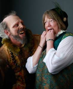
Each year the conference has a different theme. This year’s theme was Shakespeare and the attendees worked on two projects: a Renaissance self-portrait and a book. For the portraits, Russell invited a fabulous photographer, Joel Grimes, to shoot using lighting similar to that in many Renaissance era paintings. Most everyone brought a costume to wear for their portrait. Russell brought three – Caveman Shakespeare, Renaissance Shakespeare, and Futureman Shakespeare.

050115.2

The Costume
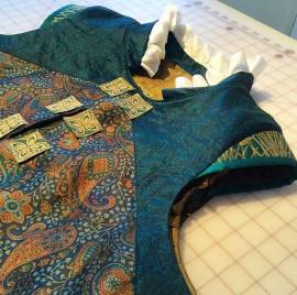
I started with some beautiful Indian sari silk that I had purchased in Bangalore, India while on a business trip. After doing some research on 16th century clothing, I made a sketch of my idea. I decided to create a man’s costume based on the cross-dressing character Viola in Twelfth Night. It took me many weekend hours to create because I was mostly designing as I constructed. As you can imagine, I had to rip out many stitches and start over several times.

050115.5  050115.12

The Painting
Let me just say right now that I hate having my photo taken. I much prefer to be the one behind the camera instead of in front of it. I posed for the portrait photo along with everyone else and I really disliked almost all of mine. The only ones I liked were the ones where Russell photobombed the shot (dressed as “Caveman Shakespeare”). I returned later that evening and had the portrait reshot—this time wearing a stunning dragon mask created by costume-maker Robert LaMarche.

050115.3  050115.4

Once I had the photo, I started to play with it in Photoshop. We were taught several techniques on how to make your photo look like a painting. I discovered the Impression filters for Photoshop from TopazLabs and really liked them. I ended up experimenting for hours to create really cool painterly effects. Once my file was ready, it was printed onto textured, stretched canvas. I picked a gold frame, attached it, and voilá!—a framed Renaissance self-portrait made with Photoshop.

050115.7  050115.8

The Book
The book project had two parts. The cover was to be designed using Illustrator and because it was made of wood, it was laser cut by a Universal Laser machine. I LOVE using these laser cutters! It is so fun to design something in Illustrator and then output a three-dimensional object with incredible precision. Once the cover was finished, I started on the contents of the book.

050115.10  050115.9

For the inside of my book, I created a set of digital paintings with Photoshop that I printed onto heavy watercolor paper. I had created these paintings by using many of the portrait photos that Joel Grimes shot of the attendees. I chose to focus on the hands – as if it were a close-up view of a larger painting. These reminded me very much of my art history classes where the professors would show magnified views of different paintings and sculpture to discuss creation techniques and details.

050115.11

The Renaissance – yet again
In 1987 I designed the first Adobe Illustrator packaging using Botticelli’s Venus as the base of the imagery. I did that because I felt that Adobe was part of a 20th Century Renaissance with the advent of digital publishing and digital art. That was almost 30 years ago and it feels like another Renaissance is happening in the 21st century as well. Artists have so many digital and mobile tools and output options at their disposal that it’s a bit overwhelming. But at the same time, I find it a very, very exciting time to be an artist.

The Photoshop Clouds filter

cloudsHave you ever tried the Clouds filter in Photoshop? You may not have noticed it since it is buried a little deep in the menus. I recommend that you give it a try. Cloud images come in handy when you are creating a collage or retouching an image in Photoshop. In celebration of Photoshop’s 25th birthday, I thought I’d share a little history.

The person who created this little bit of Photoshop magic is Mark Hamburg, currently a Fellow at Adobe, and I was lucky enough to witness it. Over 20 years ago I was writing a little book called Design Essentials, the first book published by Adobe Press. It was full of tutorials on design and illustration techniques for Illustrator and Photoshop. Mark Hamburg came into my office and my co-worker, Russell Brown joined us. He showed us how to create clouds in Photoshop in about 7-8 steps. We were awestruck and, of course, wanted to try it ourselves. I asked Mark to repeat it so I could write down the steps and put the technique into my book. I came to work the next day all ready to write up the new “clouds technique” for the book. When I walked into my office there was a small floppy disc wedged into my keyboard with a sticky note attached to it that said, “Clouds filter.” Mark had made his technique into a filter and it still lives in Photoshop today.

Here is how to use the Clouds filter in Photoshop.

  1. Open a new document or layer.
  2. Set your foreground and background colors. In part of the example above, I used a background color of white and a foreground color of a teal blue.
  3. Choose Filter > Render > Clouds.
  4. The clouds are created randomly so you can keep applying the filter over and over until you get the clouds that you like. The shortcut for reapplying a filter is Command (Ctrl) + F.
  5. To get more contrast between your clouds, try Option (Alt) + Command (Ctrl) + F.

For more information about using Photoshop Filters, here are some great tutorials:

Photoshop Touch 1.4 Interface Tour

video_thumbnail

Check out this new video tour of Photoshop Touch 1.4 by Adobe Digital Media intern, Michael Jarrott. In just 6 minutes you’ll get an introduction to tools and features as well as a primer on selections and layers. Its everything you need to know to get started creating a photo collage in Photoshop Touch.

Adobe TV: Photoshop Touch Interface Tour

YouTube: Photoshop Touch Interface Tour

Creating arrows and arrowheads in Illustrator CS6

There are several ways to create an arrow using Illustrator CS6. Here are five different methods that will give you a wide variety of arrows to choose from:

  • Using the Stroke Panel
  • Using Symbols
  • Using Glyphs
  • Using Brushes
  • Using Shapes

Using the Stroke Panel

In Illustrator CS6, turning any line into an arrow with arrowheads and tails is easy.

  1. Create any line (straight or curved) with two end points.
  2. With the line selected, open the Stroke panel by choosing Window > Stroke.
  3. Find the section titled “Arrowheads” and select your arrowhead and tail sections!

Below are some examples of arrows created using the Stroke panel:

Using Symbols

  1. To use the preset symbols in Illustrator CS6, open the Symbols panel by choosing Window > Symbols.
  2. In the Symbols panel, open the fly-out menu, choose “Open Symbols Library” and open the Arrows Library.
  3. From there, just drag and drop your arrows onto your artboard.

Here are some examples of Arrow Symbols:

NoteWhen you make edits to the symbol on your artboard it will apply the change to the symbol in the library. To prevent this, right-click on the symbol you dragged out and click “Break Link to Symbol” before making any alterations to it.

Using Glyphs

  1. You can choose a typeface that contains special arrow characters. To see if a font contains arrow characters, choose Window > Type > Glyphs.
  2. Select the font at the bottom of the panel and scroll through the glyphs (characters) to search for arrows.
  3. Create a text box. Double-click the glyph you would like to use and it will appear in the text box.
  4. To convert the arrow from live text into a graphic icon, select your text box and choose Type > Create Outlines. Converting live text to outlines is important if you would like to edit the text in the same way that you edit objects. For example, you may want to alter the edge of a text character but cannot do so if you don’t convert to outlines.

Here are some examples of arrow glyphs in the typeface Zapf Dingbats:

Using Brushes

  1. To use the arrow brushes, select Window > Brushes.
  2. In the panel fly-out menu, choose Open Brush Library > Arrows.
  3. There are three default arrow libraries in Illustrator CS6 (Special Arrows, Standard Arrows, Pattern Arrows). Open any of the libraries and select any arrow you desire.
  4. Use the Paintbrush tool and paint your arrow onto the artboard. The arrow will follow the motion of your brush.

Here are some examples of arrow created using the Brush Tool:

Using Shapes

Creating your own custom arrows using shapes is very easy with the help of the Pathfinder tool. Here’s a basic example using simple shapes.

  1. Start by creating a rectangle and a triangle.
  2. Position the two so that they overlap slightly and make an arrow shape.
  3. Open the Pathfinder panel by choosing Window > Pathfinder. Select both shapes and choose Unite in the Pathfinder panel.
  4. The two pieces have united to become one! This same process can be used with any number of shapes that you create, so get creative!

More Resources

There you have it… five simple methods to give you a variety of arrows for any of your designing needs! If you’d like to learn more about creating Arrows and Arrowheads using Illustrator CS6, check out these great resources:

[Note from Luanne: This is a post from guest blogger, Michael Jarrott, one of the digital media interns working for me here at Adobe.]

Cropping an image in Illustrator

How do you crop an image in Illustrator? You don’t have to crop the image in Photoshop or Lightroom before you place it in your Illustrator file. There are a few different ways to crop in Illustrator but these two new videos give you some best practices for cropping. In one, Adobe’s Erica Larson shows how to crop with an opacity mask and in the other she shows you how to crop with a clipping mask:

New Photoshop Touch interface tour video

Check out this new video tour of Photoshop Touch by Adobe intern, Sharon Huang. In just about 3 minutes you’ll get an introduction to tools and features as well as a primer on selections and layers. Its everything you need to know to get started creating a photo collage in Photoshop Touch.