I am the Invisible Woman

Commute-30 This week I was asked to do a 5 minute presentation at the Photoshop for Designers Conference about a project or tutorial. I chose to present a personal project. It was set up as a casual Ignite event. This was a bit intimidating because you have 5 minutes to present 20 slides and the slides automatically advance every 15 seconds.

I flubbed in a few places and I relied on notes so I wouldn’t get my story wrong. But the next day I had many people tell me that they were very touched by the project. One woman was quite emotional about it and that got me thinking. Maybe I’m not the only creative director or corporate designer or woman who is feeling invisible. So I created a slideshow with the same script and images from my Ignite presentation. I thought I would share it with you just in case my project resonates with you too.

How I made a Renaissance portrait with Photoshop and a sari

050115

The ADIM Conference
Russell Brown has been hosting the yearly ADIM Conference for many years. In previous years, I taught and assisted. But this year I went as an attendee to literally walk in the shoes of Adobe’s customers as they learn to use Creative Cloud apps. I manage a team of UX designers at Adobe who create many of the tutorials our customers use to learn our apps. As User Experience Designers, we need to regularly remind ourselves of what our customers face everyday when trying to use Adobe products.

Each year the conference has a different theme. This year’s theme was Shakespeare and the attendees worked on two projects: a Renaissance self-portrait and a book. For the portraits, Russell invited a fabulous photographer, Joel Grimes, to shoot using lighting similar to that in many Renaissance era paintings. Most everyone brought a costume to wear for their portrait. Russell brought three – Caveman Shakespeare, Renaissance Shakespeare, and Futureman Shakespeare.

050115.2

The Costume
I started with some beautiful Indian sari silk that I had purchased in Bangalore, India while on a business trip. After doing some research on 16th century clothing, I made a sketch of my idea. I decided to create a man’s costume based on the cross-dressing character Viola in Twelfth Night. It took me many weekend hours to create because I was mostly designing as I constructed. As you can imagine, I had to rip out many stitches and start over several times.

050115.5  050115.12

The Painting
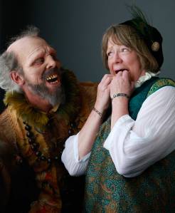
Let me just say right now that I hate having my photo taken. I much prefer to be the one behind the camera instead of in front of it. I posed for the portrait photo along with everyone else and I really disliked almost all of mine. The only ones I liked were the ones where Russell photobombed the shot (dressed as “Caveman Shakespeare”). I returned later that evening and had the portrait reshot—this time wearing a stunning dragon mask created by costume-maker Robert LaMarche.
050115.3  050115.4

Once I had the photo, I started to play with it in Photoshop. We were taught several techniques on how to make your photo look like a painting. I discovered the Impression filters for Photoshop from TopazLabs and really liked them. I ended up experimenting for hours to create really cool painterly effects. Once my file was ready, it was printed onto textured, stretched canvas. I picked a gold frame, attached it, and voilá!—a framed Renaissance self-portrait made with Photoshop.

050115.7  050115.8

The Book
The book project had two parts. The cover was to be designed using Illustrator and because it was made of wood, it was laser cut by a Universal Laser machine. I LOVE using these laser cutters! It is so fun to design something in Illustrator and then output a three-dimensional object with incredible precision. Once the cover was finished, I started on the contents of the book.

050115.10  050115.9

For the inside of my book, I created a set of digital paintings with Photoshop that I printed onto heavy watercolor paper. I had created these paintings by using many of the portrait photos that Joel Grimes shot of the attendees. I chose to focus on the hands – as if it were a close-up view of a larger painting. These reminded me very much of my art history classes where the professors would show magnified views of different paintings and sculpture to discuss creation techniques and details.

050115.11

The Renaissance – yet again
In 1987 I designed the first Adobe Illustrator packaging using Botticelli’s Venus as the base of the imagery. I did that because I felt that Adobe was part of a 20th Century Renaissance with the advent of digital publishing and digital art. That was almost 30 years ago and it feels like another Renaissance is happening in the 21st century as well. Artists have so many digital and mobile tools and output options at their disposal that it’s a bit overwhelming. But at the same time, I find it a very, very exciting time to be an artist.

What will Adobe Help and learning be like in the future?

Come to the Adobe MAX conference in Los Angeles next week and sign up for my session with Jaydeep Dutta. We’ll be showing our vision for the future of help and learning for Adobe products. Here’s the info:

Social Studies: Connecting Content and Community in the Cloud
Come see how a few simple UX design patterns can facilitate a shared, social learning experience that blurs the boundaries between inspiration and instruction, as well as between content and community. Three trends are currently sweeping digital media: Tablets are moving from content consumption to creation, social features are increasingly pervasive, and everything is shifting to the cloud. Join us to explore how this trifecta creates exciting opportunities for designers and developers, and to examine our own promising effort at taking advantage of these trends.

When: Wednesday, 10/5, at 2:30 pm
Where: Room 511A
Speakers: Jaydeep Dutta, Luanne Seymour

Create your own Adobe tutorial

11.03.09

Many people who use Adobe’s products have a huge amount of experience and expertise to share. What’s really inspiring to me is to see a very cool image that someone created and then have them walk me through how they did a particular technique. Are you one of those people? If so, you might be interested in creating a tutorial using Adobe’s new Community Publishing System. Your tip or tutorial will end up on Adobe.com. Here’s what you do:

  1. Download the Community Publishing AIR app.
  2. Use one of the prebuilt templates or upload your content in any form you wish.
  3. Your content will show up in content searches when people are looking for help for Adobe products. It might even be linked to from the product Help and Support pages.

You can find more information about Community Help here.


Three Fantastic illustrators

021408.jpg

If you haven’t looked at the Gallery on the Adobe Design Center yet, you should check it out. It is full of great work by designers, photographers, illustrators, and animators. The latest entries are quite inspirational. Three talented women, from three different continents, show their stuff. Illustrator Anastasia Gubar, aka LimKis, is a young illustrator from Russia. Canadian Christiane Beauregarde is an illustrator and animator who has made the transition from traditional media to digital tools. Singapore-based designer and illustrator Lim Si Ping combines illustration, photography, and handwork to create her collage-style illustrations.

If you have a suggestion of an artist that belongs in the Adobe Design Center Gallery, you can add your suggestions to the Submit to Our Gallery page of this blog.

What would YOU put in a Moleskine?

1005073.gif1005072.gif

1005071.gif1005074.gif

Ever heard of a Moleskine? No—it’s not made from a mole. It’s a pocket-sized notebook that artists, writers, and other creative travelers used to use to make sketches, take notes, or jot down ideas. The books went out of production many years ago but a small Italian publisher began to produce them again in 1998. At this point you are probably asking yourself why a designer from Adobe Systems would be writing about a blank paper book (instead of something digital) in her blog. Two reasons:

1. Inspiration! The Moleskine folks have put on an exhibition of notebooks by 70 different artists, photographers, designers, and architects. Of the ones I looked at, I particularly liked the books by author and artist Dave Eggers, photographers Douglas Kirkland, and Mary-Ellen Mark, graphic designer Paula Scher, fashion designer Cynthia Rowley, illustrator Paul Davis, and icon designer Egon Låstad.

2. To remind myself (and other creatives) that we need to keep sketching and writing—it helps keep our creative juices flowing! It also exercises our creative fingers, eyes, and brains. Drawing what you see forces you to really look at things in different ways. This is always a good thing for creative professionals.

P.S. If you have some really great artwork that you’d like to show in our Gallery on Adobe Design Center, let us know about it here.

Analog art in a digital dimension

Si Scott slice

Si Scott uses pen, ink and paper to create his beautiful swirling typography and illustrations. That might seem a bit backward in these days of vectors and pixels. Call me old-fashioned (okay, I admit that I’m a designosaur), but I love the fact that he doesn’t use a computer to create these incredible pieces of art. I love using Illustrator and Photoshop, but I miss the tactile process of creating artwork. This stuff is truly wonderful to behold. Look at his website, or check out the interview and video on the type for you blog.

Inspirational illustrators

I was looking through issue number 6 of Adobe Illustrator Techniques magazine and found a article on Canadian illustrator Christiane Beauregard. What beautiful illustrations! Check out her very inspirational website to see what a pro can do with Adobe Illustrator. It was nice to see a female illustrator in a typically male-dominated publication.

For different style of vector illustration, check out Pablo Lobato’s, “Lobaton” site. He specializes in caricatures and they are wonderful. My favorite caricature is the one he did of Stevie Wonder.

If you like beautiful things that come in small sizes, take a peek at Steve Buchanan’s beautifully rendered Photoshop illustrations for U.S. Postage stamps. The AIGA has his Insects and Spiders plate in their archive collection. Dig It magazine featured more of his scientific illustration stamps a few years ago in an article by Anita Jacobs. His own site is under construction right now. Let’s hope he gets it up and running so we can look at his latest stamp illustrations of vintage motorcycles. You can get a glimpse of them in the Communication Arts July 2007 Illustration Annual.

Painting with type

Today I stumbled upon this incredible site called “Typographic illustration”. What a beautiful example of animation, illustration, and typography. I love this stuff! It reminds me of the typographic illustrations done by Roberto de Vicq de Cumptich and Matteo Bologna in their “Words at Play” piece featured on the Adobe Design Center Gallery. Do you have any interesting examples of this type of artwork or interesting tutorials on how to create it? I’d love to hear about it. Leave a comment…